ONE International Organization
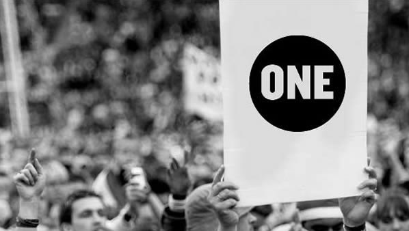
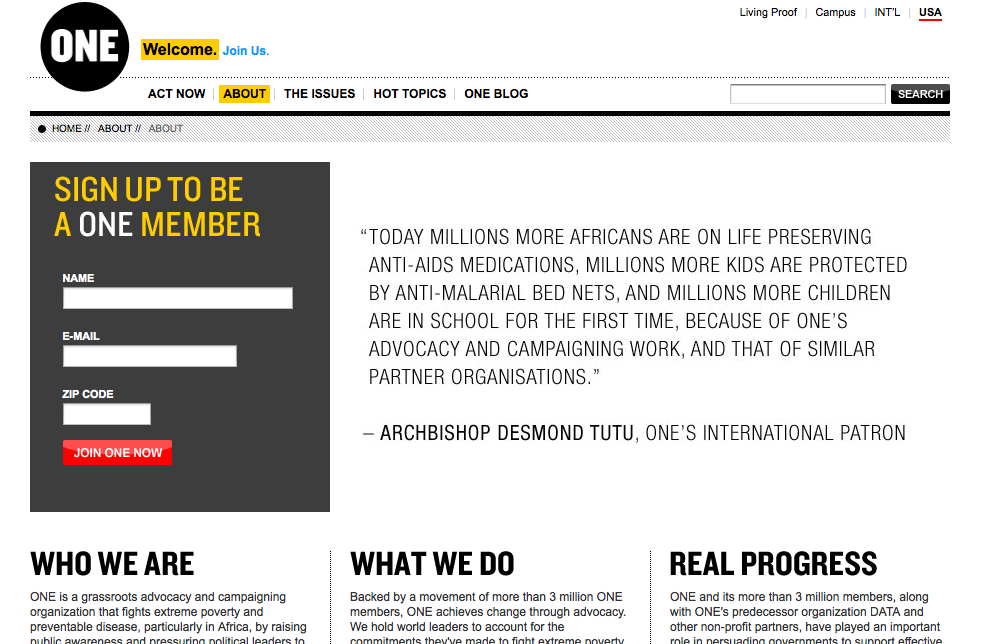
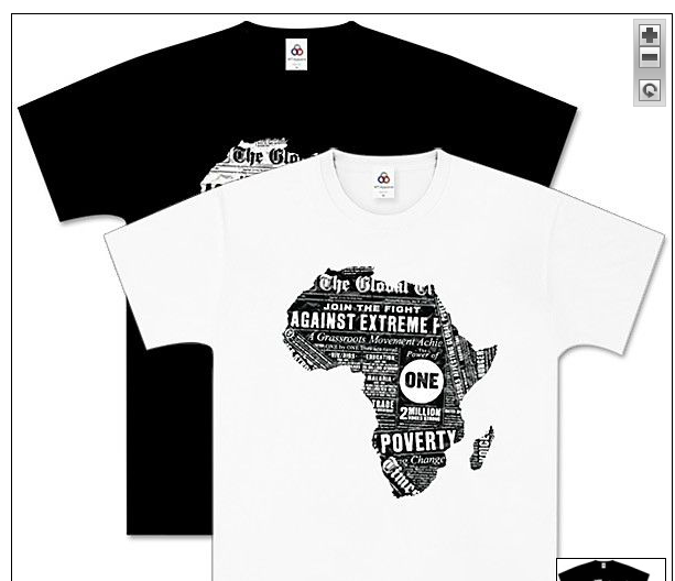
Rally sign, welcome page for website and t-shirt for ONE International organization. A diverse grassroots organization that began when several groups found a common goal, merged together to eradicate poverty and aids around the world. [1] Bono is perhaps the most well-known spokesperson for ONE, he is also a founder.
ONE first caught my attention through another form of communication – design, with its (red) campaign. Selling t-shirts, bracelets, jewelry as well as special edition Converse shoes.
ONE concerns itself with advocacy and works closely with policy leaders around the world, predominantly Africa. With 3,000,000 members around the world major accomplishments have been realized.
A partial list of accomplishments:
•Additional 450 million for debt relief for Haiti following a devastating earthquake
•provide life saving medicines to roughly 4 million Africans
•create 300,000 jobs and promote exportation out of Africa [3]
Issues ONE is working on:
•AIDS/HIV and diseases
•poverty
•agriculture
•debt cancellation
•climate
•water and sanitation
•education
•development assistance
•trade [4]
Reflection of the typography used in the organization, particularly the logo.
The logo itself often reversed in a black circle is very strong. ONE is set in a bold, simple typeface. It appears to be condensed with a very narrow counter. The negative space doesn’t intrude deeply into the letterform which helps the logo standout against the black.
When done in red with the parenthesis surrounding the word (one) the typography becomes a message of inclusion – we are all one nestled into the brackets.
The website is very clean often one in black, white and shades of gray. The current page is using yellow to add emphasis to welcome, about and join. The hierarchy is established with the work being done the largest words on the page yet the logo has the prominent position in the upper left corner. In this page Desmond Tutu’s quote calls attention from the all capital, gray scale copy with generous white space surrounding.
A few years ago the ONE campaign did a search for t-shirt designs, I did attempt a design and submitted it however the one shown was chosen. The logo is in reverse however the white space surround the word ONE in black stands out among all the other fonts used in the design. The wording is clipped to fit inside the shape of Africa.
The simplicity, bold lettering and generous negative space all work to making the logo stand out. In essence the logo is visible on what ever it is placed or where ever. It is modern in simplicity and attractive to a universal audience with is important as the organization is worldwide. The modern and uncluttered typography and design surrounding the campaign attracts attention, or if Bono attracts the attention the design retains it.
Was pleasantly surprised to find this reference to the ONE campaign in the Design Elements, “The callout of the word “One,” by setting it in solid black, reinforces the brand image and singularity.” (Samara 147) One group, one common purpose, one word. Very effective.
[1] http://www.one.org/c/international/about/944/
[2] http://www.one.org/c/international/about/3833/
[3] http://www.one.org/c/international/about/3545/
[4] http://www.one.org/c/international/issue/3803/
Samara, Timothy. Design Elements, A Graphic Style Manual. Beverly, MA: Rockport
Publishers, 2007. 147. Print.


