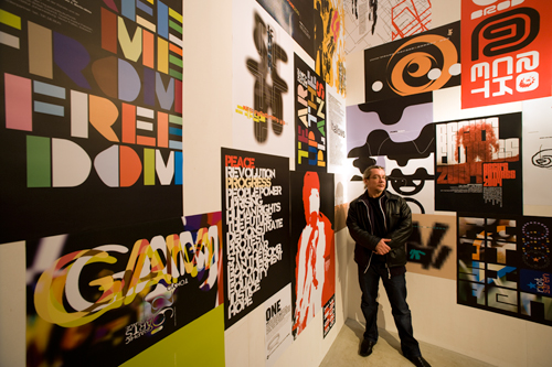
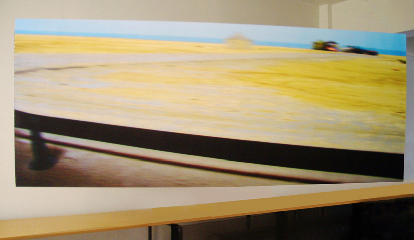
Neville Brody, a London-based designer, began to breaking rules and informing design trends in the 1980s. Brody felt that art had lost its human-ess. While an art student, this consideration played on his deciding whether to do design or art. He wondered “why can’t you take a painterly approach within the printed medium.” (Meggs, 479-80) It was an expression of emotive art which Brody was aiming – the ability to not hold back in design. This was in response to the International style that had been in vogue. The International Style was based on the grid and clean communicative message where the authorship of the designer was reduced in favor of a universal message.
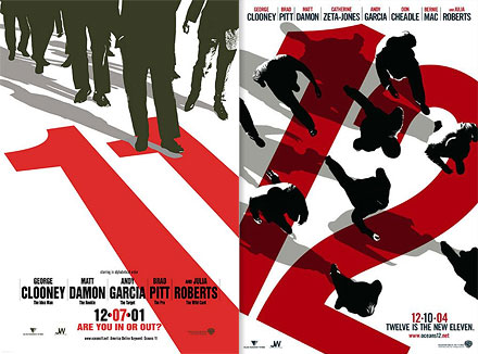
http://megsmcg.files.wordpress.com/2011/11/va12cvwe.jpg
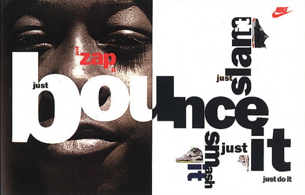
Because Brody never learned proper typographic techniques, his designs were developed through his own experimentation. (Meggs, 481) Early on with his work for FACE magazine (English) his ability to demonstrate deeper meaning in his layouts. The use of repeated elements, contrast and the use of glyphs as graphic elements all work to create a hierarchy of interest and meaning.
http://lisathatcher.wordpress.com/2012/01/14/neville-brody-a-type-of-art/
Nike ad
Brody has a fearless approach to design. He states in an interview for The Architectural Review, “For there are, he says – in typography as in other things – no real rules; what we habitually regard as rules are really just assumptions too often unexamined.” (Farrelly 11 March 2011)
In 2010 Brody attempted to unlock “unlock creative fires and ideas” by holding an Anti Design Festival. This was in response to what he deemed as “25 years of cultural deep freeze.” In addition to his independent works and lectures, he works with international firm, Research Studios. (Bec 29 July 2010)
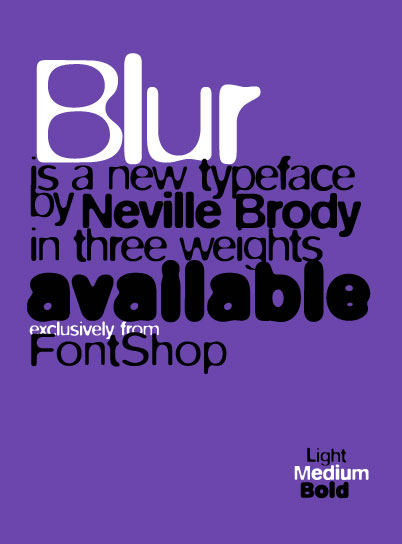
Brody also approaches typeface design much in the same way – with no rules. The typeface Blur breaks rules of both legibility and using mathematical equations to create the type face. Since the 1980s designers have been interested int he digital technology and Brody is no exception. His involvement has him busy with FontFont, a web type foundry. (Monem, 228)
Rick Poynor, in Neville Brody Revisited, talks about Brody’s quick rise to fame int he 1980s and subsequent fall. However Pynor believes that “Brody will emerge clearly as one of the most considerable designers of the period, working anywhere.” (Poynor Feb 04, 2011) He goes onto explain that Brody was inspired by Dada and the Punk period, often fuses with his own massive energy. His desire for expression left him an outsider . He often focused on left-wing political messages that also worked against him in a conservative London.
Brody’s methodology of design is based on particular eras in design history, DaDa and Constructivism. A humanist, he fought for design expression, which went cross grain with the industry. Yet his designs are full of energy and forward thinking. Brody, as Poynor states, “was struggling, though, to escape from being typecast as someone who was hung up on style (he wasn’t) and this perception has dogged him ever since.” (Poynor Feb 04, 2011)
Rules are meant to be broken, yet work is created with meticulous detail in the form or layered meaning. However rebellious or adventurous Brody is or was, he has not lost favor as his work is sought out for its ability to set trends. The BBC sought out Brody’s assistance in co-designing their new website. (Van de Merwe Feb 16, 2010)
April Greiman, was also born into the new wave of design, bored with san-serif and adherence to the grid. This new wave was copied so much that it became a new style. Meggs states “the typographic new wave strongly rejected the the notion of style and saw their work as an attempt to expand the parameters of of typographic communication.” (Meggs, 466)
Elements that Greiman and her collegues employed included, the use of ruled lines energizing space, stair-stepped rules, diagonal type, weight changes in the type face and bars balancing type. (Meggs, 466)
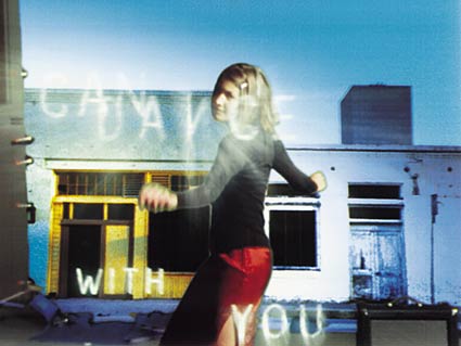
Upon arriving in America, Greiman opened a studio and furthered her creative style. Two changes were her use of color and photography.
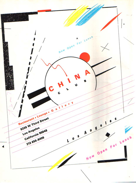
In her China Club invitation Greiman plays with depth by over lapping shapes and forms with shadows. This made elements appear animated on the page. While she was employing the PROUNS system for the elements she did not apply it to her typographic treatments. The elements themselves are floating in space which is intentionally left open.
Meggs continues with Greimans process with this, “The intuitive dispersal of elements could collasp into chaos, but a point-counterpoint organization maintains order by pulling the eye into the page through dominate elements that quickly lead to others as the viewer moes through the pages’s richness of form.” (Meggs, 468)
In a conversation between Laurie Haycock Makela and Ellen Lupton, April Greiman is mentioned for her turning the corporate world around. Makela explains Greimans approach in this way, “Using a clicky kind of humor, April found a glamorous, funhouse, zen-like center to the practice of design. She threw the Swiss grid on its back, and lovingly fucked it with color and wild imagery. This was a galactic brothel compared to the retentive, methodological aesthetic of corporate design. April was undoing the bow-tie life of graphic design.” (Lupton, 1994)
Ellen Lupton adds this, “April Greiman’s work is a painterly and personalized response to digital technology. As the progenitor of a distinctive signature style that has been widely imitated, Greiman is a legendary star who has helped fuel—inadvertently or not—the cult of personality cherished by many graphic designers. While her work is an exquisite revision of the formal languages of modernism, her approach to technology is often suggestive and metaphorical rather than structural, engaing the mythology of the machine rather than the revolutionary potential of electronic media.” (Lupton, 1994)
http://aprilgreiman.com/?page=works-in-studio&id=works-in-studio
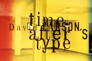
David Carson, on the other hand was a sociology teacher who found design by chance and stuck with it. In an interview for ilovedesign.com, he talks about finding design by chance. He states, “what drives me … what software I use is primarily the ease of transmission…” he continues with his belief that it is about the intuitive eye. (Carson)
Carson seems to have no set rules when it comes to design. His text overlaps and is infused with images that are inspired by his surfer roots. Working with every day items and layering images and type he creates design that is attractive to a younger generation.
http://www.unc.edu/~snider/assignments/DesignerReport.html
David Carson is often found on TED talks and interviews, the media seems to love what he has to say and the way he does so. However some criticism has been laid about Carson’s ability to communicate. The Graphic shares the cover of Trek, which is designed with layers of type over lapping along with a limited color pallet. Some may feel the cover to chaotic. When asked about this Carson is quoted as saying ““Don’t mistake legibility for communication.” (“David Carson”)
http://www.kenyaferrand.com/pics/web/css_layout/david.html
References:
April Greiman, Accessed July 21, 2012. http://aprilgreiman.com/?page=works-in-studio&id=works-in-studio.
Bec, Alex. It’s Nice That, “Neville Brody: The Anti-Design Festival.” Last modified 29 July 2010. Accessed July 20, 2012. http://www.itsnicethat.com/articles/2931-neville-brody-the-anti-design-festival.
“David Carson.” The Graphic (blog), http://www.kenyaferrand.com/pics/web/css_layout/david.html (accessed July 21, 2012).
Carson, David. “David Carson, A Designer’s Story.” . July 21, 2012. http://www.ilovedesign.com/uk/exclusives/interviews/david-carson-designstory/.
Farrelly, E.M. The Archetectural Review, “1986 August: An Interview with Neville Brody, Art Director of The Face.” Last modified 11 March 2011. Accessed July 22, 2012. http://www.architectural-review.com/archive/1986-august-an-interview-with-neville-brody-art-director-of-the-face/8611931.article.
International Poster Gallery, “International Typographic Style.” Accessed July 22, 2012. http://www.internationalposter.com/style_primer/international-typographic.aspx.
Lupton, Ellen. “Underground Matriarchy.” Ellen Lupton (blog), http://elupton.com/2009/09/underground-matriarchy/ (accessed July 20, 2012).
Meggs, Philip B. Meggs’ History of Graphic Design. 5th. 1. New Jersey: John Wiley , 2012. Print.
Monem, Nadine. Font.The Sourcebook. london: black dog, 2008. Print.
Research Studios, http://www.researchstudios.com/2009/02/05/neville-brody-exhibition-at-rocket-space-tokyo/
http://www.itsnicethat.com/articles/2931-neville-brody-the-anti-design-festival
Poynor, Rick. The Design Observatory Group, “Neville Brody Revisited.” Last modified Feb 04, 2011. Accessed July 22, 2012. http://observatory.designobserver.com/entry.html?entry=1537
Van de Merwe, Bronwyn. BBC, “A new global visual language for the BBC’s digital services.” Last modified Feb 16, 2010. Accessed July 20, 2012. http://www.bbc.co.uk/blogs/bbcinternet/2010/02/a_new_global_visual_language_f.html.

