As a kid growing up my boundaries were outlined by four streets, Newburg, Cherry Hill, Wayne and Palmer. Many streets dead ended at the woods, Wayne road held Norman’s market, were one dollar meant a weeks candy stash. As a teen a walk around the block meant a four hike, each intersection located a mile apart on the country road. Directions were easy because each road was one mile in all directions.
Never gave this much thought until stumbling upon Holly Holzschlag, Thinking Outside The Grid article. Holzschlag recounts flying over cities and looking down on the city footprints. She tells us that Tucson was a planned city built on an orderly grid system. Whereas London, the city she compares Tucson with, is built in a spontaneous fashion. [1] It is also a much older city, growing organically through the centuries.
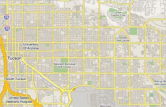
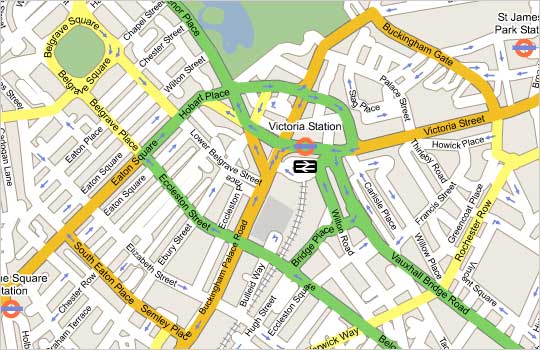
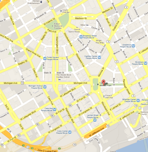
Looking at these maps one can see how the structure of the orderly gird system is easy to navigate, even dependable. However, the trip can become a little monotonous. Driving around Detroit, built with a central district and circling out into the grid can be exciting as roads wrap and wind around the cities top attractions and business district. However it is also easy to get lost.
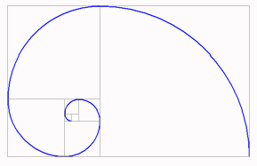
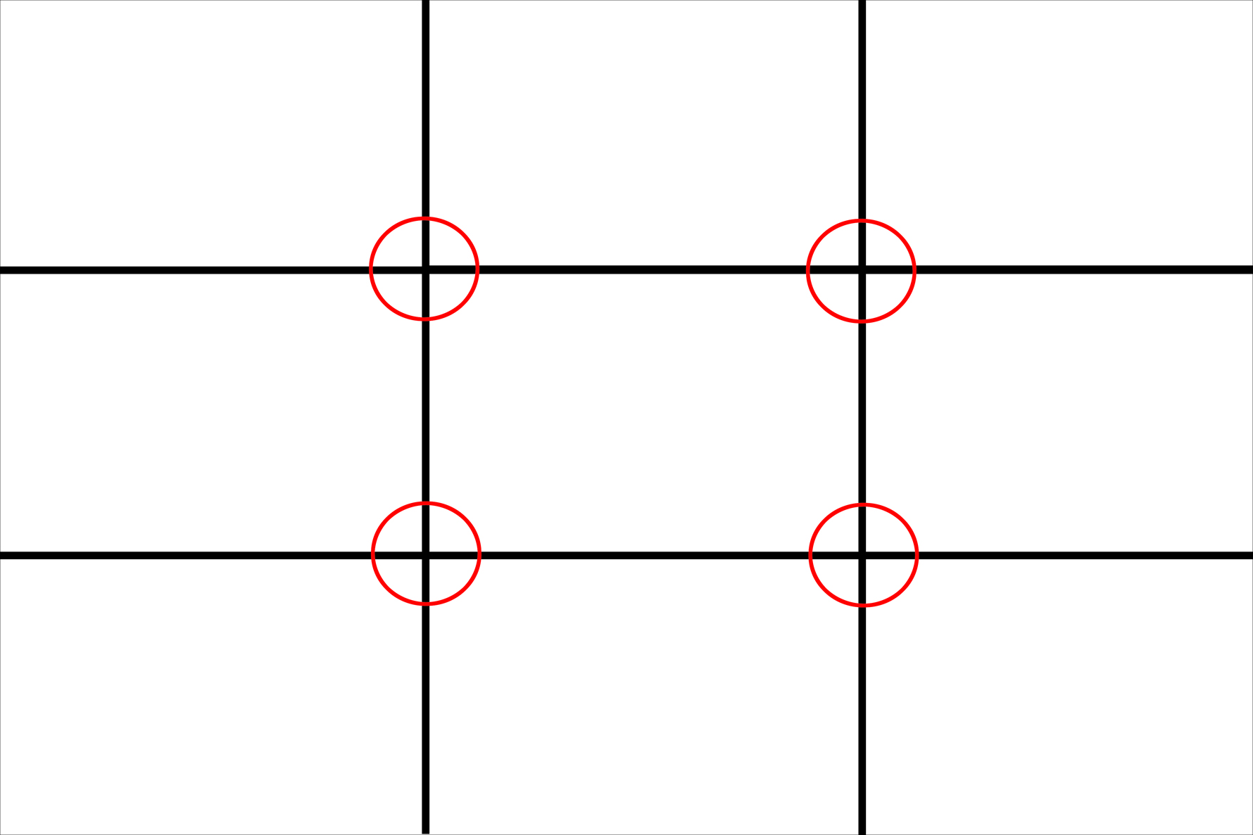
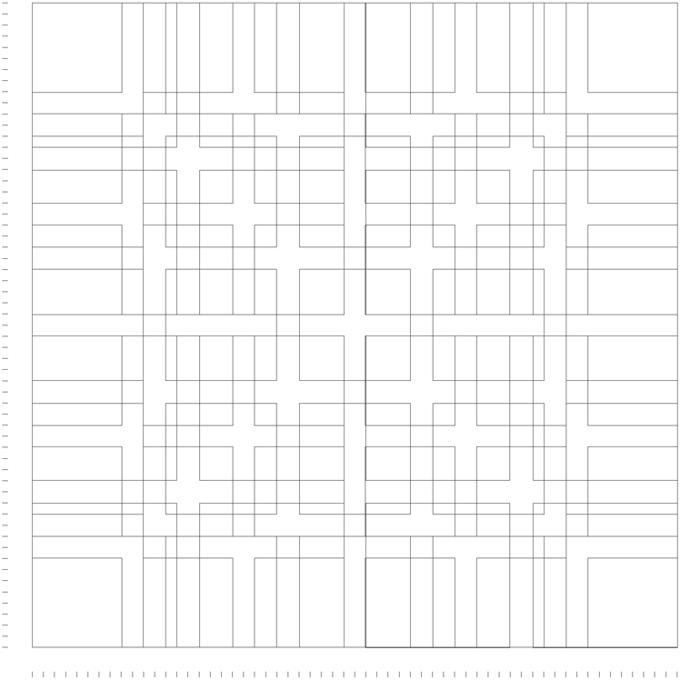
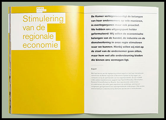
Successful print and web designs are based on a grid system. The grid is an invisible foundation that helps the designer align the elements on the page/spread. Common grid systems are the Fibonacci Systems, the rule of thirds and a modular system. The modular is often thought to be the most flexible.
Ellen Lupton, Thinking With Type, says this about the golden mean, “This means that the smaller of two elements (such as the shorter side of a rectangle) relates to the larger element in the same way that the larger element relates to the two parts combined. In other words, side a is to side b as side b is to the sum of both sides.” [2]
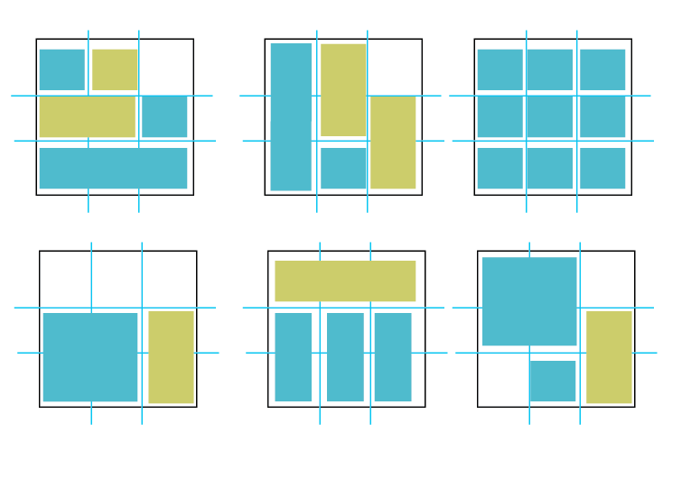
She goes onto discuss the modular grid system developed by the Swiss designers in the 1950-60’s, Gerstner, Ruder and Müller-Brockman. [2] The modular grid offers a wide range of options while not forcing the grid. In her book, Graphic Design, The New Basics, Lupton talks about the 9 square grid and its ability to build irregular and asymmetrical designs. [3]
This modular grid which was created by Karl Gerstner, takes the grid to extremes. [2]
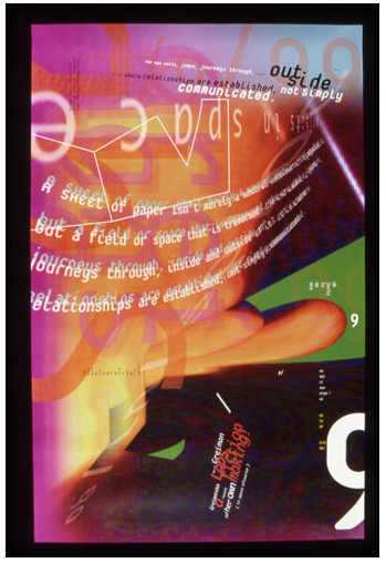
Order can suck the life out of a party as well as a good design. Yet just like art, before you can abstract the form you need to understand the form. This is the same for grids. In the world of design deconstructing the grid became the thing to do in the 1980’s. Designers like David Carson were responding to the audiences growing sophistication. Timothy Samara, in Making and Breaking the Grid, talks about the media bombardment as a catalyst for this change, “In an effort to create a meaningful impression that competes with, and distinguishes itself within, this visual environment, designers have pursued various new ways of organizing visual experience.” [4]
In breaking the grid the surface of the plane is challenged. Objects may recede or come forward in a seemingly haphazard manner. Or perhaps the grid is place on a series of angles. April Greiman’s poster for AIGA, entitled Objects in Space, is among a series of posters that challenge hierarchy, explore optical space and appear not to have a recognizable structure.
To break or not to break, it is not a question just a matter of when to do which. You decide. . .
Borrowed from Tyson, Typography Love (SCAD student)
[1] Holzschlag, Holly. Thinking Outside The Grid. A List Apart http://www.alistapart.com/articles/outsidethegrid/
[2] Lupton, Ellen. Grid. Thinking With Type. http://www.thinkingwithtype.com/contents/grid/#Golden_Section
[3] Ellen Lupton, and Jennifer Cole Phillips, Graphic Design, The New Basics, (New York: Princeton Architectural , 2008), 176. Print.
[4] Samara, Timothy, Making and Breaking the Grid, A Graphic Design Layout Workshop, (Beverly: Rockport, 2002), 118-9, 145. Print.

