Much of the feedback received pertained to the use of negative space to surround the word ONE and the ability to flip the black and white for a variety of uses. Most felt that the negative space made the logo stand out as well as the use of a simple typeface and color scheme which made the typography emotionally appropriate.
This example shows a clever use of negative space in a logo for a guitar store. Visually the “T” first stood out. Looking closer I realized it was actually two guitar necks and a shape that formed the “T.” Certainly a guitar player, the target audience, would have discerned the guitar shape immediately.
Mark Boulton in A List Apart, discusses the use of micro and macro white space. He references Erik Spiekermann’s redesign of The Economist, allowing for better readability through the use of whitespace. Boulton states this, “adding more whitespace to the individual characters. He then set the type slightly smaller and with more leading. All these changes added micro white space to the design. The overall result was subtle…”
Macro whitespace would be space between major elements and micro whitespace – the space between characters or words.
Boulton suggests that whitespace which leads the reader from element to element is considered active whitespace. Passive whitespace then is the space that allows for compositional harmony.
In Typographic Design: Form and Communication, Amos Chang regarding space to define form states, “. . . it is the existence of intangible elements, the negative, in architectonic forms which makes them come alive, become human, naturally harmonize with each one another, and enable us to experience them with human sensibility.” (Carter, Day, and Meggs 51) The way words and letter forms are put together creates a syntax of visual syntax.
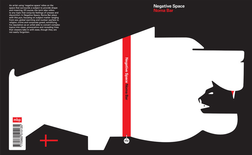
Design Reviver, shows an interesting example of negative space drawing attention to the focal point is shown below in which you have to look closely.Is it a cat or a dog, or both?
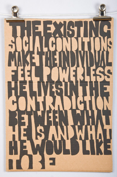
This experimental typographic piece from James Write Lo-Fi Designs, uses the positive and negative to communicate a message of contradiction, while at the same time the visual communication is equally contradiction in that it is black and white, the type is both negative and positive, while the typography takes up every inch of the page. Even the counters are blocked as a solid part of the letter further exaggerating the effect.
Cited References:
Carter, Rob, Ben Day, and Philip Meggs. Typographic Design: Form and Communication. Fifth. Hoboken, New Jersey: John Wiley & Sons, 2012. 51. Print.
http://www.alistapart.com/articles/whitespace/
http://www.designer-daily.com/logo-design-17487
http://designreviver.com/articles/use-of-negative-space-in-graphic-design/
http://www.james-wright-design.com/index.php?/projects/mass-media-posters/


